#experimenting with some different art style thingys
Explore tagged Tumblr posts
Text
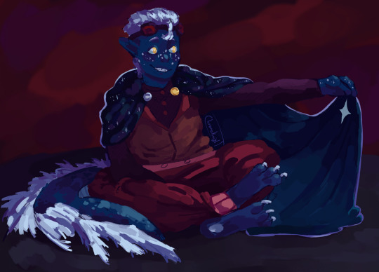
Tanguish with his cloak :]
[closeups under the cut]

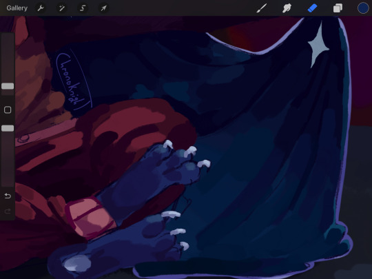
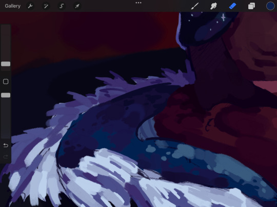
#tanguish#redstone and skulk#mcytblr#art#myart#holy fuck. this drawing#i have no idea why it tired me out so much#it didnt even take that long. somehow#i feel like ive just run a marathon#experimenting with some different art style thingys#and the background OH MY GOG#its not that complicated but it took me SO LONG TO DECIDE ON WHAT TO DO YOU HAVE NO IDEA#IM NOT EVEN SURE IF I LIKE YHE BACKGROUND I ENDED UP WITH#BUT ITS DONE NOW!! AND I'M NOT TOUCHING IT!!!#audio_feedback#anyway read redstone and skulk! please#edited because i hated the background colour and now i am nit touching it anymore
81 notes
·
View notes
Note
(if this was already asked im so sorry! i cant with tumblrs search thingy) hii!!! i havent drawn in ""my style"" in years, but your art has inspired me to try again. do you have any tips on how to develop it and become more consistent? much love and thanks <3333

hello !!! dw i don't think this has been asked beforee so ur good :3
imo you can't really brute force developing your own style. i think it slowly develops over time the more media you consume and get inspired by ! (i mean, i'm still trying to find my style so yk,,)
in my case, i tend to gravitate towards more semi-realistic styles, so i would need to develop my fundamentals (gestures, anatomy, line of action, etc, etc..) first as a base point. i would say learning your fundamentals is important even if you want your style to be super cartoony bc it really does help when it comes to deciding which parts you want to exaggerate and stylize and stuff. (it may be boring for some people but i promise u it rlly does help a lot !!!)
btw ur anatomy doesn't have to be perfect on the get go when u want to try stylizing 😭 shit even my anatomy was p bad before i started drawing in my 'style' so dont be discouraged !
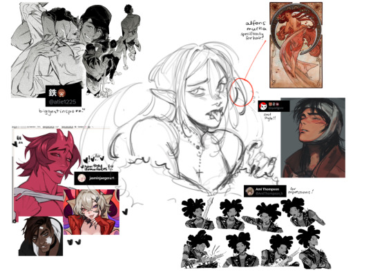
@/atie1225 @/jasminjaegerart @/quietgom @/AmiThompson_h
ok when it comes to stylizing what i find helpful is copying certain aspects of an art style i like. ur not stealing their whole thing btw !! but u should try to analyze what parts of someone's style that you like !
like for example, i like how Alfons Mucha does hair, so i implement it in how i draw. i remember i liked how Ken Wakui does noses bc its simple enough, so that's what i currently do, i liked the nose bridge lines thing from mha and jjba so i added it to my drawings, and so on and so forth
obv these arent all my influences, there's probably thousands of artists i like, shows i've watched, comics and manga i've read that influenced me etc etc and our art styles are just a mish mash of all of that ! it's actually super cool to see how different people draw depending on what influenced them so ykkk
as for consistency don't be afraid to use your own art as references ! shit even i have a couple of my drawings in my inspo board because of how much i like them and sometimes i would look over and try to remember how i did those LMFAO
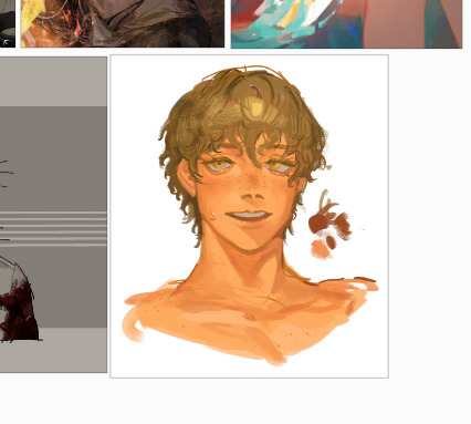
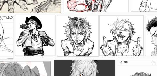
but idkkk i don't think you have to strictly adhere to your style. imo experimenting is good and seeing how it changes over time is super cool ! so you shouldn't stress urself out about that :3 eventually you'll develop the habit of sticking to your style, it just takes a bit of time !!
i think that's all, i hope this helps :3
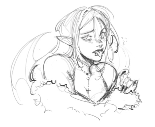
heres the drawing by itself bc i kinda like it
#im so glad my stuff has somehow inspired you wahgghhhhuhuhuhuhu.............#i wish u the best of luck !!!! and as always this is not all gospel do whatever seems right to you !#franswers#shitty art advice (dont listen to them)
126 notes
·
View notes
Note
I know I could probably google this myself but it's never really clicked for me. I don't expect that I'll get it any time soon but I'm curious
How did you first start oil painting?
I mean, I've only worked with digital art for years now, I learned to draw alone in secret. Digitally, because my family has always been too poor for me to be wasting paper. But I digress. the few times I tried oil painting the last year, my self confidence plummeted because it's absolute mud every. single. time.
Did you take classes? Did you have a person guiding you/ someone to talk to about it? What do you do if you make a mistake that you can't fix with an undo button? how do you deal with the loss/waste/cost after a failed attempt? Is there unspoken rules to traditional art that would be common sense to most but helpful to point out for a slow person like me? (Not derogatory, I literally am)
Please ignore this ask if it comes across as too parasocial, my apologies!
I started just last semester cuz the community college i go to has painting classes. like some art classes do she had starter pack thingies prepared by an art supply store that allowed us to get a set of the bare minimum supplies at a way more affordable price. I won't lie though; it's an expense. student discounts and waiting to buy materials while they're on sale are how ive survived this so far but i definitely can't be churning out paintings cuz i can't really afford that
My professor always emphasized taking everything you do as a learning experience--the successes and the failures. but ALSO the fun thing abt oil paint is there are few mistakes you cant just wait for it to dry and try going over it again. it's actually very forgiving in that regard--it forces you to commit to your brush strokes but also you can still go over them. keeps u moving forward. trying too hastily to fix mistakes while its still wet does tend to overmix and make it muddy though
my prof also had us do color mixing drills and skin color mixing drills that helped immensely when it comes to actually making things the color u want.
ALSO the last bit of advice (apologies if you do know this already) is that physical painting is actually a lot different than drawing--we had very skilled students in class with zero drawing experience, and we had experienced artists who struggled a lot with oils. It's a lot more about creating planes of light and shadow and color and refining it--its much, much less about line-heavy art. Our professor discouraged us from painting too many lines and instead allowing lines to simply be the border between different colors or values. (not that line heavy oil paintings are impossible, just that the tools and process don't lend themselves to that style as easily and itll be very hard if youre trying for that out the gate)
20 notes
·
View notes
Text
AAH! HUMANS!
my rottmnt human designs (and redesigns)✨✨ (feat. My shitty fucking camera that cannot correctly capture colors for the fucking life of it!)
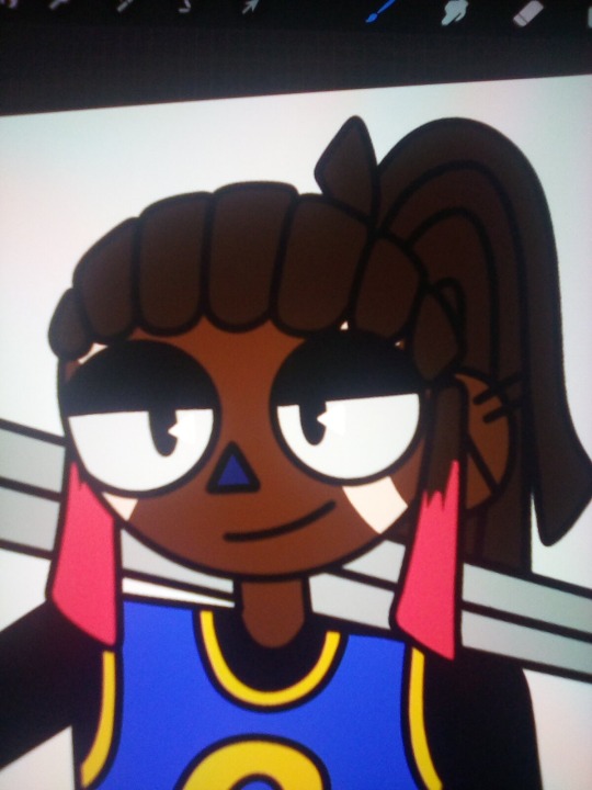
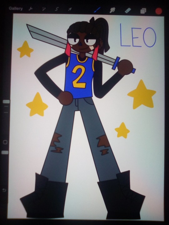
Leo✨✨
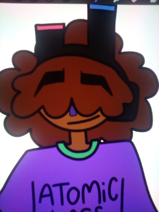
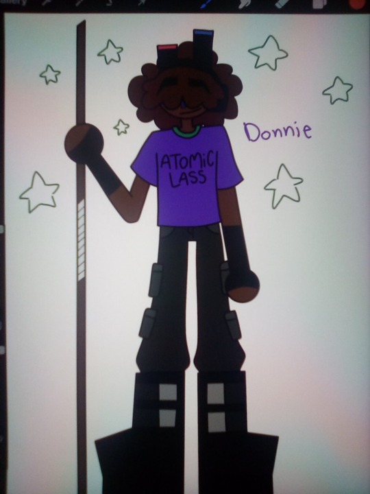
Donnie✨✨
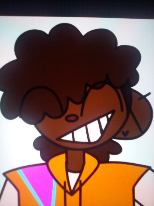
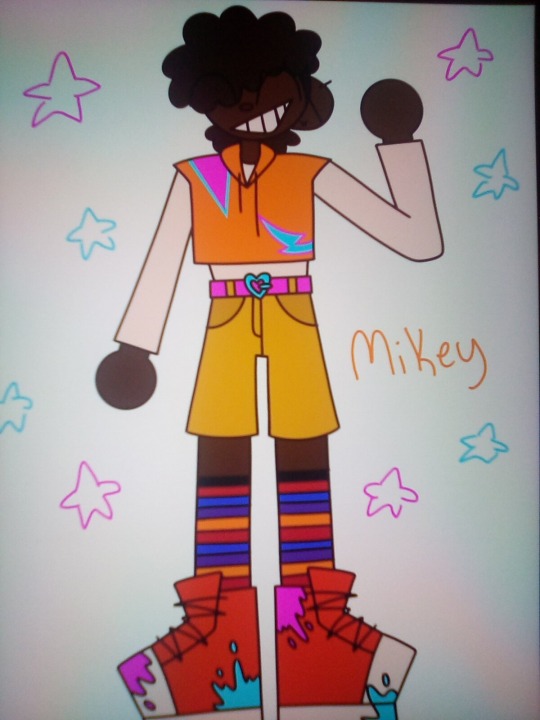
Mikey✨✨
No Raph :[
Ill get to him eventually- (maybe)
Additional ramblings below 👇👇👇
Leo:
I only changed a few things about Leo, because I generally liked the design, there were just a few things that irked me.
The outfit- I liked my previous outfit for Leo, but it didn't feel like something he'd wear everyday. Casually, maybe. I took inspiration from the episode Air Turtle and instead went with a basketball jersey (bc he plays basketball in my human au) the skinny jeans stay, bc he's a whore.
The hair- I originally did blonde tips on his hair, but decided I liked the brunette better. The blonde also are his face look really busy when paired up with the vitilago for his eye markings. I did however color his front two little strand thingies red to mimic his eye markings.
Donnie:
Donnie changed quite a bit from his original design, ill add the og design for reference.

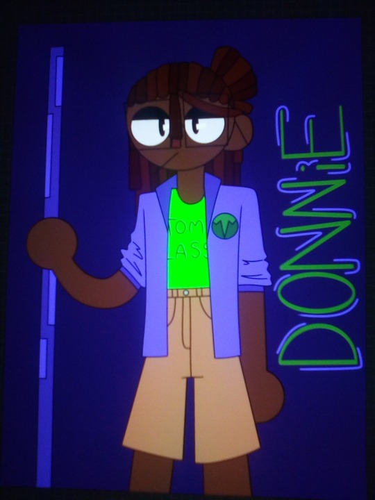
Okay so-
The outfit- I kinnnnda hated his og outfit. The neon green shirt is a massive eyesore, the khaki shorts. Just no. I kept of the Atomic Lass shirt, but made it purple instead, to better match Donnie's color palate, and went from tan shorts to black cargo pants. I feel like Donnie needed more pockets to carry stuff in, and it looks better, from a fashion standpoint. I also gave him demonias bc duh.
The hair- I swapped him from locs to an afro for a few reasons. One, the reason I dont draw eyebrows is bc I draw eyes so comically large that they just don't fit on the face, and I wanted Don to have his trademarked brows, so I picked a hairstyle that covers his eyes, and allows space for dem brows so he can still emote. Also with a less detailed style I was able to add his goggles without it looking too busy.
Mikey:
Ive kind had a vision for Mike since the beginning. I wanted him to wear something versatile he can move around in easily, but also something colorful and fun to match his personality.
The outfit- I wanted something artsy and fun, but also light. So I picked a cropped hoodie (ik its a vest with an undershirt in the pic; I changed it after taking it) and a pair of shorts and a cool belt. I feel like Mikey is definitely a fun socks guy, so I gave him some striped socks with the turtles' colors on them.
The hair- so in case it doesn't show in my art, Mikey's hair is supposed to be a frohawk type deal- kinda like this
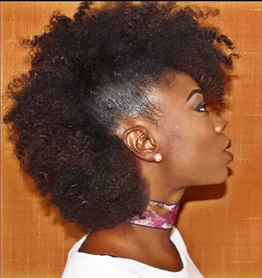
I picked this bc I just thought it looked cool when I was experimenting with drawing different hairstyles.
Raph:
Ive been putting off drawing Raph, bc I dunno why, but no matter what I do, he also comes out looking....... Questionable.
Extra Note- I changed my human au comic to a fic because: one, I don't have the time or energy to draw a comic. Two, I like to get detailed with my writing and you can't do that with a comic.
Thanks for listening to me ramble ^ ^
Please reblog my art <33
#leodraws#leoslastbraincell#please for the love of aphrodite please reblog#art#my art#digital art#drawings#rottmnt#rise of the teenage mutant ninja turtles#rise of the tmnt#save rottmnt#unpause rottmnt#rise leo#rise donnie#rise mikey#art ramblings#tmnt ramblings
28 notes
·
View notes
Note
Hello! Lately I've gotten a huge inspo boost from your personal projects (especially... birbs....) and fanart
and I started to wonder — what media was the most inspiring for you? How did different fandoms influence you and your art direction?
I simply adore the range of different media that you post and talk about (like starting with scifi and ending with forest whimsy) but I feel like there are still some general trends in your artwork! How would you describe your taste(?) in art direction? Or perhaps it's something not possible to grasp and put into words?
Love your artwork!! Best wishes!!! <3
First of all, THANK YOU for this question, it's really really touching that someone is interested in stuff like this. Also SORRY for not answering for so long, because you are right and this IS a difficult question, partly because I view my art direction and media taste as two separate things. If you want to hear more about...birds...and my thought process behind their development, I made a podcast about them after the second episode released. I'm making a guess that you must follow me somewhere else given that you know about my game, so, if you speak the language I won't name you can listen to my rambling in my vk group.
If we are talking about fandoms I think I was REEEALLY affected by Over the Garden wall and Gravity falls as a kid. As well as a bunch of horror stories, I think "pen pal" was the first horror story that made me fall in love with the genre as well as the concept of kids facing situations that even adults may find difficult to handle. I generally love child adventures that have a darker theme to them. This is present in my...birds...game only in emotional manner, BUT, both of my next games are going to be more direct horror stories, so I hope to play with this a bit more in the future. (Also my friend said that "the left right game" explains a lot about things that I like and write and this IS my favourite horror story of all time so...like, cmon, my next game is literally going to be a creepy roadtrip adventure and this isn't even the first horror roadtrip im going to write)
Tonally I'm really inspired by things made by Davey Wreden (the Stanley parable, The Beginners Guide), One (mp100, opm) and Toby Fox. I just love how these guys manage to create silly light-hearted experiences that are pack full with often times difficult emotions. This is something I REEEALLY want to achieve in my stories. Also the Beginners guide became a really big deal for me as a kid because of the way this game literally spoke with the player. Up until the last couple of years I viewed art solely as a way to reduce loneliness and feel a connection with other people, even through the screen, so my main goal with birdcatchers was to recreate this feeling of personal conversation, even if less direct.
If we're talking about visual style, I'm really inspired by Brecht Evens and Plastiboo, and I got into mixed media because of Чистотел in vk. I won't say that Im anywhere close to these people but they are very inspiring for me. Anyways - my current "philosophy" in art is that I want my pictures to have more air in them and also spend as little time on them as possible. This is easy for me in traditional art (for example these chalk thingies), but still not so much in digital, however you can see that I'm kinda doing the same unfinished line art and blurry colouring thing with it too.


21 notes
·
View notes
Text
A Date with Death 💀💻💬
TL;DR: What's totally hot is that we are chatting with this major edge lord who is cosplaying as the Grim Reaper. What's even hotter is that this major edge lord actually is the Grim Reaper...pfft, yeah right.
Game Link: https://twoandahalfstudios.itch.io/a-date-with-death
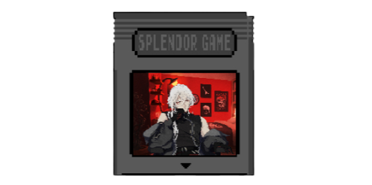
Notable Features: Customizable MC (pronouns, appearance, name, etc.), Customizable bedroom, Internet romance, Supernatural LI Spiciness: 2/5 -- It can get a little suggestive, but nothing unholy...unfortunately T_T LI Red Flags: 0.5/5 -- The guy's trying to kill us but I mean...it's kinda his job so...? Also! This isn't even a yandere LI so, just a heads up! We're changing gears a bit
Wanna know more? I didn't see a rating on it, but I wouldn't suggest anyone under 16 play this. But if you are over 16 or simply don't give a rat's ass about my warning, I can't effectively police ya, so let's get into it!
(Unrelated, but peep the additions and new section marker...thingies. Ahhhh~! <3 Okay anyways...)

I found it. I finally found it.
I found a game that has me raving harder than Perfect Love, and those of you that read that review (or even some of my follow up posts) know how much I absolutely loved that game!
Even still, so far, Perfect Love is still my favorite visual novel with a yandere LI; in this one, the LI isn't a yandere. Admittedly, this was a totally foreign experience to me, because I honestly (and clearly) gravitate towards the yandere stories, not to mention just simply favoring and have a preference for them. Like I've mentioned in other reviews, it is just something about a man with an ungodly obsession for me that just draws me in...
Anyways, that's not featured in this game, but it was still just as good! I loved this! The story, the dialogue, the art, the little quirky features, the customization!! Gods, the customization. I loved that! The customization didn't even hugely matter, but it was just the fact that it was included and that I knew that that was what the MC looked like.
As a POC, it is so refreshing to know that my love interest "knows" that I have dark skin. Like, ahhhhh, my heart. Representation really does make a difference, even in adulthood. I love the games with the custom pronouns, or just straight gender neutral language, or even when they draw the character to be bald, grey, and faceless so it represents everyone. I honestly love it so much, and I do feel included, not gonna lie, and it's exciting that others can, too.
Anyways, I'll rant and rave and rant some more during the review. I've really gotta get into the amazingness that is this game, and I'm definitely going to keep the spoilers extremely light (like always) to ensure that you can play with a vague idea of what's going on but not knowing exactly what's going down.

So, oh my Gods, boom.
The game kicks off with a little exposition on how we're pretty much living life final destination style. Some way, some how, death seems to always linger around us, but it just never seems to connect. Just picture a situation where we 112% should've died, but we somehow come out damn-near unscathed. No injuries, no long term scaring, no broken bones, nothing. Like...we're Gucci, and just straight up living our best life.
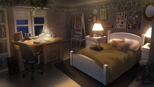
So, we're chilling at home one day when our laptop keeps going off. Consistently and incessantly. It gets pretty annoying pretty fast, because:
Who the hell is trying to get ahold of us that damn bad?
What app do we even have on our computer that's making all of that ruckus?
So, naturally, we go investigate, and it's this weird ass messaging app on there. Never seen it before, never used it, and have no idea where it came from because we didn't download it. Delete. Immediately delete. Only issue is that, when we delete it, it comes right back, and we can't delete it anymore. Okay...what the hell?
Not having much of a choice, and just out of curiosity, we click on this app, and we just see a wall of text from what is likely either a bot or a scammer.
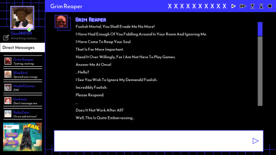
Having nothing better to do, we confront this scammer bot, and we go back and forth with this totally not a scammer bot...thing...for a hot second. Basically the whole of it was that this basement creep was trying to convince us that he was the Grim Reaper and that he was after our soul. No, like, no lie. I have receipts. This man deadass said that he was the Grim Reaper and that he was coming for our soul.
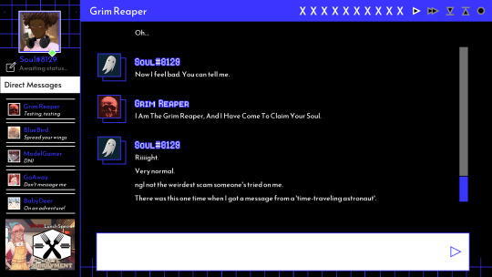
See? I wasn't joking.
We continue to go back and forth with this weirdo about how all of this is fake and ask him is this a cry for help, and he gets all pissy and says that we have a small and smooth brain and all of that jazz before it finally gets to a head. Mr. Edgy over here finally decides that he's had enough of our shit, and he sends us a request for a video chat. Still having nothing better to do, we enter the call, and well....
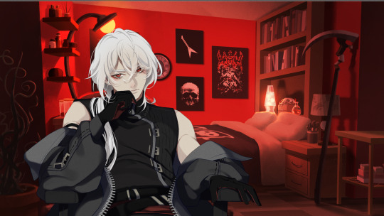
....okay, definitely not how I'd imagine some incel living in his parents' basement that reeks of constant rejection and a middle school boys' locker room to look like. He do be kinda fine. Fake as hell and a major edge lord, but kinda fine. Hella fine, actually. Deathly fine, amiright? Ha, ha....haaaaaa. Okay, moving on...
So, now that we're in this call, admittedly, we're a little taken aback because, well for one, he's actually pretty damned attractive, and for two, he is still insisting that he's the Grim Reaper. Like, yeah, okay...
It gets to a point where we finally cave and start to play along, and we're just like "Okay, if you're really the Grim Reaper, then you should have no issue with reaping my soul before the week is up right? If you can get it, you can have it. No questions asked."
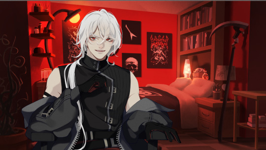
Upon hearing this, he is clearly intrigued, and he arrogantly says "Lmao I only need an hour" and we're like "Lmao then why haven't you already taken it?"

Silence. Exactly what I thought, "Grimmy".
Anyways, he agrees to being "honour bound" to the bet or whatever the hell his edgy ass said. Before the bet gets solidified, though, we establish what our winnings would be should we win, and you already know that we asked for...
THAT MAN'S HAND IN MARRIAGE.
I mean, come on: his own house, stable work, hot as hell -- this man is the full package. Fuck a soul, I'm trying to fuck him.
I mean, he...didn't really, like...agree to that, so we opted for his soul instead. Fair is fair, but apparently our soul is on the line so we can't screw this up. Oh noes! The big scawy weaper is gwonna come gwet mwe! Lol.
Unless...
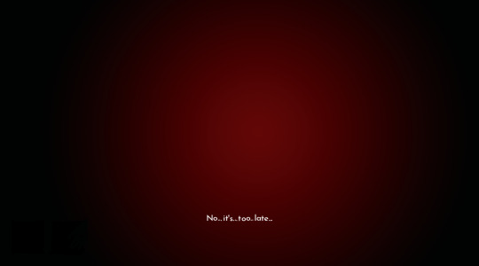
...this is a very real bet with very real consequences, and we made a very stupid mistake.

Where do I even begin?!
I loved this game! It made me laugh, it made me cry (not joking, it really did), it made me feel things.
Like, holy shit, I'm so used to the yandere games where you're essentially like "This man is hot, but he is fucking nuts, and I need to get away from him", that it really starstruck me when I was like "...I want to marry this man and live happily ever after". Like...there was nothing toxic this time around it and it was...huh? Kindness? Positivity? Boundaries? What is this?
It was deadass like being in a string of toxic relationships and finally finding the one. Not even just the one, but a legitimate healthy relationship. Like, I have no idea how to react to this, but it's such a fuzzy feeling. Grim literally got me over here giggling and kickin' my feet and shit.
Anyways, this visual novel was really, really good and an absolute chef's kiss. The pacing, the story, the humour, the customization, the art, the UI, the everything! Everything was so good! Like, if you couldn't tell, my favorite thing was by far the customizations. Let me show you what I mean:
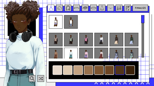
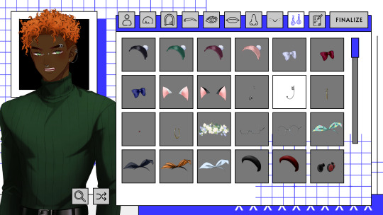
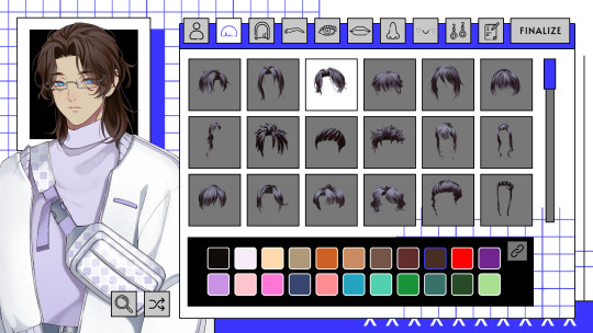
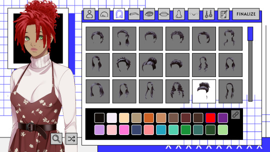
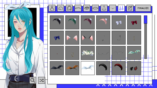
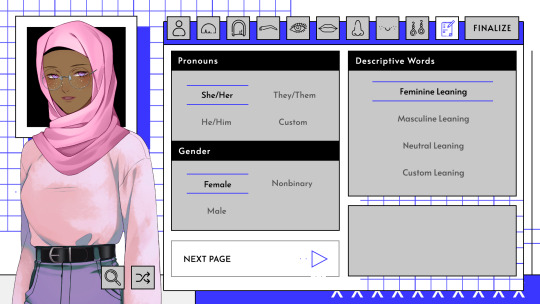
Like, how cool is that? The screenshots doesn't do it full justice, but from looking at the characters that I made, you can tell that you can customize quite a bit. Granted, it doesn't play a huge role, and there's not side sprite or CGs with the character that you customized, but I still like that there was an option so that it's like "Fuck yeah, he knows I'm Black" ya know? Not to mention, you can also customize...
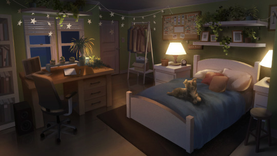
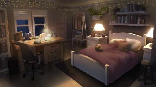
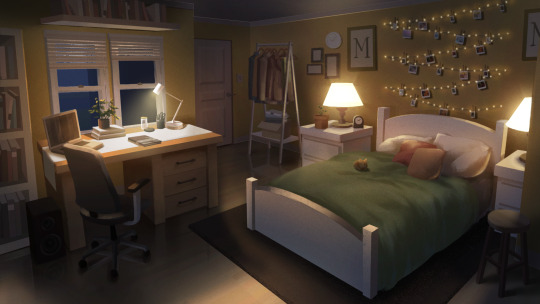
...your room and your household companion! You can even have a snake as your pet, if you choose to do so!
I'm sorry, I was just absolutely geeked about the customization options. Honestly, the overall art in the game was just absolutely stunning; however, I did wish that there were more CGs, but that's more of a personal thing versus a flaw of the game. I just wanted to see more of this sleek ass art, because, as I've mention, I am an absolute slut for CGs.
Anyways, much like the Perfect Love game, I could definitely ramble on and on and on and on some more about this game, but I'm going to demand -- not ask but politely, yet forcefully demand -- that you play this game and enjoy it so that you can see how edgy yet sweet this man can be. And like I said, the dialogue is so funny. Admittedly, my humour is kind've broken, so I laugh at just about anything, but I think the dialogue was legit funny this time around. And again, the way that it just switches over from being a total meme to something kind've serious to super sentimental and sweet and it's...like what? The transition was just so damned smooth. Like, the dev(s) absolutely killed that shit. No debate, and don't at me because outside opinions that oppose this idea will be ignored.
That being said, I cannot stress enough how much this game needs to be played. It's so good. It's so funny. It's so sweet. It's so sleek. It's so everything. Like, just play it. You'd be doing yourself a disservice if you didn't. Okay, okay, but that's enough gushing and rambling. Here's a link for when -- not if when, because I demanded it, remember? -- you play the game for yourself, and drop those supportive words of "This game is fire as fuck, dude" and maybe some monetary support if you can.
Anywho, I'm not the dev(s), so my transition to the end won't be as smooth, but I'm going to go ahead and end it here!
As always: Don't forget to drink water, don't be dumb, and hope to see you around~!

A Date with Death
#visual novel review#vn review#visual novel#a date with death#adwd#adwd casper#adwd grim#a date with death vn#a death with death visual novel#a date with death vn review#a date with death visual novel review#a date with death casper#a date with death grim
33 notes
·
View notes
Text
Replies
Some replies, mostly about yesterday’s posts: Lilidia kiss and Aether portrait.
Anonymous asked:
It finally happened. Someone accused me of being a creep just cause I said we shouldn’t spend too much time moralizing over cartoon characters and that we literally have scientific evidence to say so. I’m the one with the oc that I’m shipping with ortho with the open minded mom. It’s time to start posting the most cute and wholesome ship art on main.
-💜🌹
💜🌹Anon, it’s great that you are expressing your opinion honestly, and I am very sorry that you are getting called a creep for that. Unfortunately, the “you’re creep” type of people don’t usually listen to reason because accepting that you’re right would mean that they can’t bully people for no reason anymore.
I hope you don’t feel discouraged by that experience though, and I hope they won’t ruin your desire to draw and post whatever you want. If you want to post cute and wholesome stuff, that’s good, but it sucks when it happens simply because it feels too dangerous to post anything even remotely spicy… Even if you did things in an extremely subtle way or even if you did anything else, they’d still find reasons simply because they might find you suspicious or other bs reason like that. Every single one of their argument is just an excuse for them to feel justified about harassing, that’s why it doesn’t even matter what you like – as soon as you show interest in anything slightly different than a bland creation of family-friendly nothingness, they’ll be here.
Take care of yourself, but also, don’t be too scared of them: there are much more people who openly like Ortho these days, I think.
Anonymous asked:
For a moment I was super excited thinking you had gotten in to genshin. But its still nice to see aether in your style. And I may be wrong but I feel you might like dottore
Sorry, Anon, unfortunately I don’t think I’ll ever get into Genshin… but this 6+ portraits thingie is a nice chance to draw some of the characters! And I am very happy that you’re happy to see Aether drawn by me <3
There are still a lot of characters for me to draw from that list, and while I don’t know when exactly I’m going to draw the next Genshin character, here are some other names from the list: Freminet, Neuvillette, Arlecchino, Scaramouche, Pantalone, Baizhu, Furina, Lyney. Quite a lot of names… One day I’ll draw them all.
Also I do agree that if we ever got into Genshin, we would’ve loved Dottore. He has certain vibes… bad ones, in a good way.
Anonymous asked:
GENSHIN ART RAHHHH! Also Lilia's undercut looks clean. Imma need his barber's number
Hehe enjoy!
I think Lilia himself is Lilia’s barber… which honestly makes his cut even more impressive!
Anonymous asked:
Did you know Traveler legit has a harem in Genshin Impact? As in, every person in every nation is falling for them. Twinks, men, girls, and everything in between. My favorite is Childe x Traveler because he's a sadist, a masochist, and I like freaks.
Well I know nothing about Genshin because I’m not really into it, but I figured that the main character is always the most popular guy/girl in the series… such chick magnets! (the guys are also the chicks, btw)
thestar-eyedfictionaddict asked:
Aether in your drawing: *exists*
Every living thing in Tevyat: *hands over their credit cards.*
The rich ones pay you the most to make NSFW art of the Traveler.
Meanwhile, Paimon's using all that money to get food.
Oh god, so many new customers, and I have no idea what’s going on. Thank you, every living thing in Tevyat, especially the rich ones 😭 Paimon shouldn’t steal my money though, or I’ll make her into food.
thestarlightfae asked:
How are you feeling about his official forehead reveal?
Hmmmm. Whose? 🤔 I am not sure.
If it’s about Lilia, then well, Idia is the only one who got to see it lol
thestarlightfae asked:
Also! Love the Zero to Hero ref!
Anonymous asked:
it's not really the main point of the drawing but damn cool shirt design
clever
Hehehe thank you!! <3
I am very happy you liked it! I always want to put something fun on the character’s shirt when I draw, and every once in a while it actually looks fun.
Should I make it into an actual print…
17 notes
·
View notes
Text
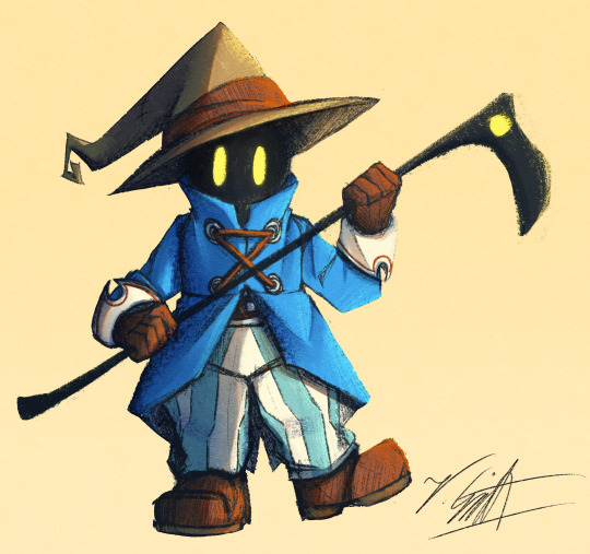
I've crawled out of my cave after playing Final Fantasy IX for a long ass time what have I missed?
Artist's Notes:
I'M BACK BABY! A while back I made a post with a new style experimentation thingy but I ended up deleting it because it was just kind of a boring face thing, I was planning on doing more art but then I started playing Final Fantasy IX and uhhhh yeah so that game has kind of taken of my brain for the past two weeks and I am 20 hours into the game because I love it so much. I wanted to draw Vivi because Vivi is just really fun to draw ok? I've kinda been feeling really burnt out with my lineless style, mainly because of how hard it was to do lighting. I'll show one of my initial art style tests on the bottom of this post. Again, used to have it be an individual post but it was just one face so it was kinda boring, so might as well include with this one on the subject of art styles. I wanted to kinda mix some aspects of my older style with the sketchy shading lines with a more painterly way of doing the lighting (mainly in the shadows). All in all, I think that's my favourite part about this drawing, it feels nice to finally be able to do some proper lighting again, and I want to experiment even more with my lighting and rendering in future pieces. Also, part of the pant shading got kinda lost in the sketchiness, so for next time I'll probably focus on the clarity of the more sketchy parts of the drawing, since I did go with my initial sketch for the final drawing. I also gave up on the background since I had no idea what to do for it, and I didn't put too much detail into the staff as I forgot which one I gave him in my current playthrough and I didn't want to risk spoiling myself via looking up references, but that's ok I like how the singular yellow circle on it matches Vivi's eyes. Also I was having a bit of trouble figuring out how to draw his body and how to pose him, but I like how the pose turned out a lot. It was inspired by his idle animation when in a battle in game where he does a little shimmy.
Ok I need to talk about Vivi's design because I love it so fucking much oh my god-
I absolutely love how his face is just in complete shadow and only his eyes stand out, it's so cool and unique and I love how they recontextualized the original black mage design from the classic Final Fantasy games. How they did it I won't say because I don't wanna spoil the game, but someone give this poor baby a therapist because he goes through a lot. Actually, same can be said for all of the FFIX cast, they all need therapy (again, I won't spoil anything, please go play the game for yourself).
While I do love almost all the characters in the game, even though Vivi is most fun to draw, my favourite character has to be Zidane (the main protagonist of the game). He's a really fun protagonist, and they could have easily written him as a misogynistic jerk who doesn't respect women but they didn't, and I really appreciate that. He's just an overall cool dude who's a really nice older brother figure to Vivi and also just has a cool character design (who I also want to draw eventually). Initially in the game I was planning on grinding levels for Vivi to make him the tactical nuke of the party, but then that title went to a different character (who was initially multiple levels behind the group since I grinded the party in the starting area way to much before they joined, but now they are two levels ahead of everyone and have pulled the team through a lot of tough battles, again I won't say who it is because it is kind of a spoiler and the way the gameplay actually ties into their character arc is just so good omfg). Once I eventually finish the game I'll probably write a full review on here, so no spoilers until then lol
Also, I've kinda been burning out a bit with making Touhou art, which also made me a bit burnt out with Touhou stuff in general (although I will continue keeping up with the manga) so getting into other things (i.e. Final Fantasy and even Fallout since I've watched the first season of the TV show which is a whole other post for another day) has helped me refresh and given me something new to think about. I've ended up in the exact place I feared ending up, where I would start drawing fanart for it not because I wanted to but because I felt like I had to, so I'm taking a bit of a break. When I do draw Touhou fanart again I'll try to draw for the sake of myself, and to all the other artists and fanartists on this platform (and on any social media for that matter), take care of yourself and don't forget to take breaks when you need to!
(Ok part of that last paragraph was definitley influenced by the good ol' "it's 9:00pm and I need sleeb, but the message at the end still holds up, always take care of yourself)
Oh yeah, and here is that one style experiment I did btw
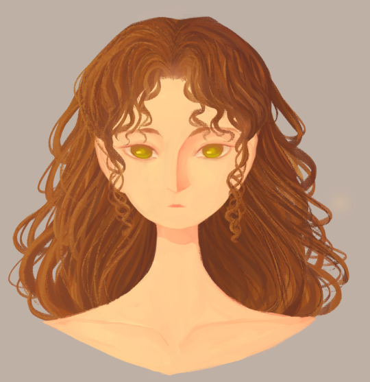
Man I really fell down the "Yoshitaka Amano art enjoyer" to "Final Fantasy fan" pipe line didn't I?
23 notes
·
View notes
Text
So… picked up my lazy-ass and drew a full cast, finally, after not doing it since like 2022, so here is it, the UDoALG newcomers in my style (I got some things to say with all the designs so it’s gonna be a long art post)
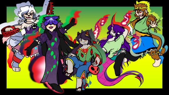
So, to go trough all characters:
Son Biten
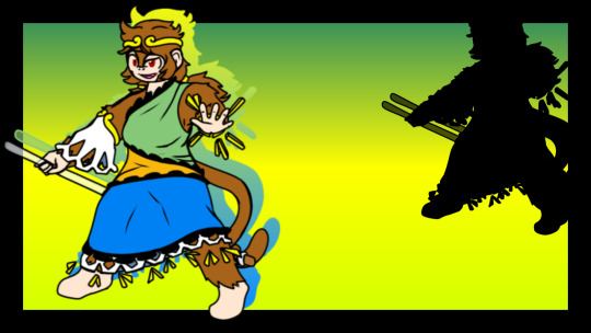
Something that I do when I draw characters that are supposed to be animals but are not portrayed as the animal directly, is add the animal’s trait on them
What I did with Son was add the monkey fur on her body, just that really, so it’s not all that different from the original
Enoko Mitsugashira
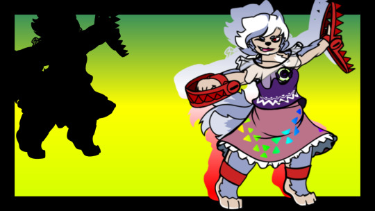
I really like how her design ended like, like Son’s, I added more animalistic traits on her character, giving her more fur on the body, I’m pretty content on how her face and cloth patters (and general design really) ended up
I also really like her color sheme
Chiyari Tenkaji

A design I ended liking more and more as I drew her really, gave her obscured arms and legs since I read in a post that the Tenkajin could have been an especially powerful Mujina, which I believe was a Badger youkai basically, so I wanted to see how her design would look with badger coloration
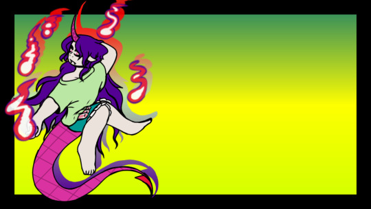
Here’s a version without the coloration too
Hisami Yomotsu
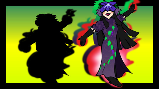
Her design was an experience, the dress pattern… nevertheless a design I really like tho.
There’s not much I can say, had fun doing the “flame” thingies
Zanmu Nippaku
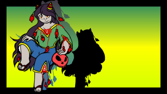
Another design that grew on me as I read of her character and I drew her, was not nearly as complicated I thought it was gonna be, I don’t know what possessed me to do the face wrinkles tho… but they don’t look THAT bad in my opinion actually…
Anyways, that’s them, now, a quick ramble…
I was gonna post these ones to my reddit first because of the memory, since there is where I started posting my art back in 2021, However the site decided to update and block phone users from posting galleries with notes, which was THE reason I started posting there. So I’m not posting there anymore, I want to draw more too, so if I draw these girls again, expect these designs from me
#touhou#touhou project#unfinished dream of all living ghost#my art#touhou 19#haha#haven’t done this in a while#Son Biten#Chiyari Tenkajin#Hisami Yomotsu#Zanmu Nippaku#Enoko Mitsugashira
57 notes
·
View notes
Note
Hiii.. (*´ ˘ `*)/
From the top of my head you're art trademark is that your general style is really sketch/paint like, you can typically see the individual strokes, which is incredibly pretty and cute !!
Another one I noticed is how you experiment with art styles a lot :3 A majority of your newer art is each in a different style and you pull them off so beautifully!! My favourite is a bit older but its the one-line themed ink drawing, I think it was for a coffee prompt..? Very gorgeous and delicious ♡ It's always a treat to see your art !
[ * WOAGH...... LONG ASK..... /POSITIVE ]
[ * mhm I sure do love experimenting with my style I think just most of the shaping work is truly consistent along with some other details ]
[ * Some of that experimentation is because I may alternate between art programs (most of the time I use Krita but may occasionally mess with brushes, but also I may use Animal Jam Play Wild the ANIMAL GAME and now more recently Animal Jam Classic ANIMAL GAME AS WELL) ]
[ * The painty stuff is because when rendering I make an additional layer and there paint in details!!! ]
[ * as to the coffee prompt thingy I think I know what drawing you're talking about, it was for last year's inktobertale, a tad aged but still looks great because it's only been just a few months lol ]
[ * anyway tyyy !!!!!! This was a fun ask to answer :OO ]
6 notes
·
View notes
Note
for the art ask thingy you reblogged, mayhaps 8, 12, and 17? (don't feel pressured to do them all)
ty for question! there will be a lot of text below bc i like to talk about my art or myself😭 i'm an egocentric😭
8. What do you like most about your own work? It's hard to say, because i criticize myself a lot or treat my art like idkkk things i have to do while i'm still alive?? like creating (anything) is literally the meaning of my life so my work to me it's kinda like a "vacuum the apartment" item in to-do list. you vacuum your apartment, delist it, and then forget about it forever but if to think a little deeper it's hmm i like the style in which i’m drawing rn, though i’m still not really happy with it. but this whole styling thing is super hard to me after years of academic art 💀 if im super tired my hands automatically draw something realistic and this really upsets me bc i don't want to draw realistic things :( i don't post many original art here, but i love the sense of freedom it have, that i’ve worked very hard for and still working on it! like replacing "how to do it acceptably?" with "how i want it, how i feel it and how to do it honest" in my mind. honesty and sincerity are the most important things in my life, work, people etc. there are many problems with this now because of the russian laws and autocracy, which has long been more like totalitarianism. i have a hard time saying and doing what i think, constantly having to go around/come up with metaphors/not putting something out there at all, even changing ideas and plots. it disgusts me, i hope i can emigrate in the next two years or so, freedom is a key value for me and ok if to be more abstract, i like the fact that I draw/etc for myself, i.e i create something that i lack in this world. every time it gives me a feeling of satisfaction (though it doesn't last long) that "there! at last I see what i wanted, what i craved to see". i.e actually i work from "i don't like what there's rn, i want to see it differently, I want to do it other way". as if the store didn't have clothes in your size and and you'd have to sew your own
12. Show your favourite drawing from this year
i realize that this question implies one drawing, but idc and will show several instead of just one :^) the first drawing that comes to mind is this! well it's not exactly a drawing ofc but still. it's one of 54 illustrations for the play "the shadow". i love this work very much (text here says "your country is like every country in the world" in different languages, and on the color block the phrase is "it's all so mixed up", it's quotes from the play)

and three more illustrations for the same play! best part of this year in terms of art is probably that i finally got into lettering. although it's not lettering in the classic sense here, like these lettering aren't meant to be readable, i just think the letters are very pretty:^)


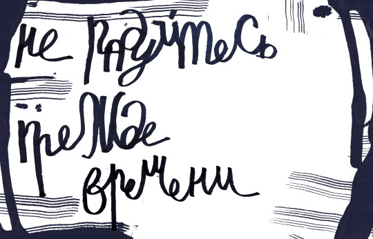
and the last one. this fanart turned out to be very important for me! i drew it some time after my diploma and finally for the first time in a long time allowed myself to loosen up and not think about what others will think. thanks to this art i realized in which style i wanna work:^)

17. What inspires you?
almost anything tbh. movies, books, theater, songs, science, news, colors, clothes, people, whatever in personal projects, it's usually a reflection on current events/experiences talking to people and their stories inspire me a lot on a more simple level: music/songs. i believe that any visual composition is music (even Kandinsky wrote about it and he himself considered his abstract works as painted music). So rhythm, intonation in songs and other things inspire me af. i always make playlists for every big project im working. it's not even about the lyrics of the songs, it's about the vibe/mood they give. (i had an exhibition this summer with illustrations for "the shadow" and like i put a disco projector there and made a 6 hours playlist 😭 bc all the illustration were based on music (and i hate exhibition snobbery, pseudo-intellectualism, and in general when people consider themselves superior to others. i also think that looking at pictures without music is boring) aaaaand i'm also inspired by the words themselves? (you can notice in the pictures above, haha). sometimes by the meaning they carry, sometimes just by the way they look. and the letters inspire me bc that, again, is music to me. the rhythm, the plasticity, the contrast. i just love letters ahahh
thanks again for the question and hope it was interesting! have a good day/night/morning/etc ! 💞
7 notes
·
View notes
Text
New hypmic anime season and I'm BACK IN THE FUCKING BUILDING AGAIN (I feel like the Martha I'm coming home sweetie audio)
Thoughts on the 1st ep of Hypmic Rhyme Anima+. Spoilers beware
New plotline lets gooooooo I like that they're straying away from the drama tracks actually, Rhyme Anima is fundamentally a different experience from the core drama tracks which gives new material for both new and old fans OP is an actual banger, Ramuda's verse is the best fight me all you want but you know i'm right Nemu!! uh spoiler chara for anyone new to the anime I guess? Like they spoil her right at the introduction and iirc they didn't really build off her mystery in the first season. Makes her impact here a bit weaker but I'm willing to let it slide since some might not catch it (Post Editing Astro here: I haven't rewatched Rhyme Anima since it finished airing and uh. Nemu definitely was a plot point there lol they dropped it after ep 11 but she was there!) Jyushi my son I love you so much you idiot I love the little stingers for each team that they did for each team, its so cute and gives so much personality The visuals have definitely improved, a big step above the last season in terms of animation i don't see an improvement with story writing though… Pacing is still all over the place and very squished/fast paced makes sense since the cast has grown by a quarter since last season but still makes me sad that there isn't much time given to each character individually I forgot how much I love the localization of Doppomine Okay so Pink hair and Green hair in the flashback are most definitely the two in the white cloaks. Theres just no subtly with this series lmaoooo Nice that they were able to incorporate everyone somehow but too many people means that too many parts to handle I'm getting deja vu, this exact same thing happened last season…. Oh. Its the same guy. Makes sense lmfao Listen bud I have minimal rap experience but that rap was just embarrassing wow. No rhyme or flow, there was only straight passion which i mean props I guess but you suck ass Look at me being so smart and predicting all of these ahead of time without looking at any materials Did Rio just contact Jyuto with his hypmic???? Samatoki have I ever said that I love your for being a bullheaded idiot? bc I do. you're so silly Damn the typography has gotten even better, its just a lot more smooth and the animation too especially during Jiro's part is just so stylish The animation has improved a lot I'm glad it got a little more love compared to last season My guess is that maybe someone from the six divisions will fall under the anger thingy that's going around, something like the stage show. My biggest guess is that they might re-incite the Samatoki and Ichiro conflict again but I hope not. Another guess is that there will be old MCD or Naughty Busters beef which seems more plausible given that this is Sasara and Kuko's anime debut but I guess we'll wait and see THE OUTFITS!!! THE STUPID OUTFITS I LOVE THEM the art style of the ED is super pop punk and has a strong sense of style which i love. its simple but stands out really well which i love Very jjk but more toned down. Feels a bit like a cleaned up croquis drawings the smear frames is just so stylish and good, very simple and a bit messy and sells the gesture drawing kind of feel of the ED Ramuda's parrot costume i love you Those hand signs just make the first letter of each word which is really fun. Not proper JSL though I guess beggars can't be choosers esp for a series like this
Overall, a really strong start. It shows how it built off the first season and where it improved and while some things (like the horrid pacing) never change, at the end of the day its still a fun and delightful watch
If anyone wanted to read my thoughts on the first season, they're all archived here
#hypmic#hypnosis microphone#Hypnosis Mic: Division Rap Battle: Rhyme Anima+#hypnosis mic rhyme anima
8 notes
·
View notes
Text
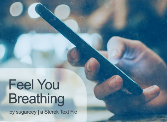
This is definitely a long time coming, but I finally wrote a text only fic for Sterek, complete with a stylized AND plain text view for reading! Also my first long fic that I've written since...I don't even know when (aka it's NOT a drabble or ficlet!!). This is also belated from July, but for reasons you can read more about below the cut. Inspired by @yearoftheotpevent's July prompt "stars," as well as sniperjade's Masturbation Midsummer Bingo 2023, using the square "I can't anymore," and Summer of Cum 2023 prompts "creampie," "come marking," "precome," "come swallowing," "coming untouched," and "coming in pants" (yeah, there's definitely a spicy theme here :P).
Title: Feel You Breathing (<- on AO3) Rating: Explicit WC: 8.4k Tags: Texting/Sexting, Established Relationship, UST, Porn with Feelings, Porn With Plot, Fantasizing, Teasing, Banter, Filthy, Dirty Talk, Masturbation, Idiots in Love, Writer Derek Hale, Bartender and Graduate Student Stiles Stilinski, Business Trip, Flight Delays, Coming In Pants, Coming Untouched, Nipple Play, Light Dom/sub, Bad Pick-Up Lines, Humor, Shopping, Sex Toys, Kink Exploration, Werewolf Mates, Anchors, Love Confessions, Pet Names, Romantic Angst, Stiles AND Derek are Little Shits, POV Alternating
Summary: Derek: So, you need a distraction. Stiles: Maybe Stiles: It’d be better if you were here to help me with that. Stiles: ;D [Or: Sexy things start late one night when Derek gets a text from Stiles and escalate from there. A few secrets are revealed along the way.]
Some of my lovely Sterek friends know I've been dabbling in and out of writing text fics since last year (2022). Easier said than done 1000%, I'm going to tell you that right now. It only took me 3 tries to get it right! (And yes, it means my other 2 WIPs need to be reworked, le sigh.) It's one thing to write a text fic, but it's a completely different beast to style the damned thing with AO3 skins while making it as legible and accessible as possible. I thankfully know how to code in CSS and HTML, but it took me quite a long time to create a custom skin template that I liked and could reuse while getting the look and feel just right for our idiotic boys and the overall Teen Wolf world. Texting and sexting is legit an art. There are so many ways to approach how to write a text because each person does that differently. There's also intention required when using emojis, figuring out how someone would react to things, and hell, even playing around with timestamps and timezones is important. A text fic isn't just about words. All the tiny details add up and make a new experience. I think I took a full week to QA this whole fic because I wanted the aesthetic to look good, and it was worth it! It was nice to make something for myself, which let me write dialogue and banter and a lot of fun things I normally wouldn't had this been a different kind of fic. Super grateful for having a Write-A-Thon sprint weekend, which motivated me to finish the bulk of this baby up. And when I think about it now, this labor of love was originally supposed to be an experiment for me to play around and learn more about coding intricacies. It was supposed to be a short Porn without Plot thingie (but uhhh, it's definitely Porn with Plot and Feelings because that's the way it is). 1-2k words somehow became 8k+ words. No regrets though. It has been a long time since I've felt good about writing something this long and doing something different than the norm. It has been such a blast coming up with all the texts in this fic, because they're humorous and spicy with the usual banter and sarcasm we love between Derek and Stiles. But hey, there's some romantic angst too (they might be texting and using words, but they could do better, of course). Anyway, I hope you give this a read when you have a chance. Enjoy!
#year of the otp#teen wolf#sterek#stiles stilinski#derek hale#MasturbationMidsummer#summerofcum2023#teen wolf fanfiction#fic challenge#spicy#fic rec#self rec#my fic#sugareey
9 notes
·
View notes
Text
Elven goes Comic Park Artist Alley 2023
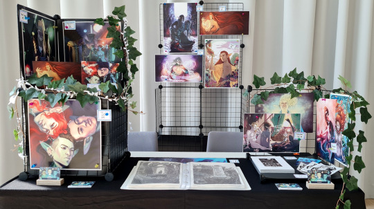
Here it is, the post I threatened to make! It's gonna be long and full of ramblings, but I wanted to write everything down and idk, maybe you'll find it interesting to read! xD
So, this was my first time tabling at an artist alley. I had applied to another con near-ish me a couple of times in the past but never got accepted, so I was quite floored when it worked here at first try this time around xD I was hella nervous all the way up until the day I actually had to go and leave for some reason. Beforehand, I gathered some inspo at other cons for table setups and invested a little bit in one of those wire-shelf thingies, cause since it's very modular I would have also been able to make good use of it if it turns out artist alleys aren't my thing after all. I got a small collection of prints printed, I wanted to stick with a theme (namely, my original fantasy stuff, since fanart is a legal grey area and I wanted to be on the safe side - also, themes are nice!).
I managed to fit everything I needed for the table into two big Ikea bags and left on Friday noon for the con (we were allowed to set up starting at 2pm that day, the actual con starting on Saturday at 9am). I also set up two small shelf units for putting on the table upfront to save some time!
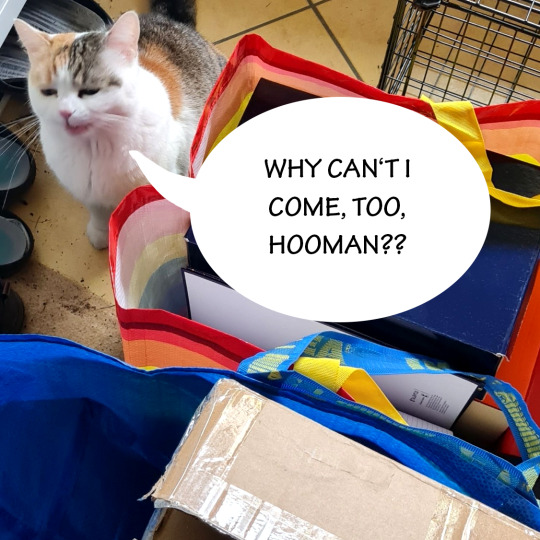
My cat was not impressed.
Setup and everything worked out without problems, the helpers were all super kind and welcoming. The only thing that was kinda chaotic was that the con organizers and the owners of the location (the artist alleay was in a whole new building, and the location overall is insanely pretty) seemed to kinda work against each other in a way xD Communication didn't quite work, and I think if we as artists and our helpers had received at least some kinda document or ID or a little coloured wristband that said "exhibitor" or something, it would have prevented a lot of arguments and delays. But alas, maybe next year!
Since I had a quite long drive and didn't wanna do that twice every day, I stayed at a hotel nearby. It felt a little like a mini vacation, which was nice xD Cost-wise, I would have ended up paying the same amount in gas that I paid in hotel fees.
As I said, as soon as my table was set up, all nervousness from before had kinda vanished and despite my days starting super early and ending very late, I had a blast overall xD Only thing is, I didn't sleep well (but I rarely do when I know I have to get up early, the anxiety of missing my alarm haunts me in my dreams).
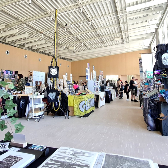
My view for the weekend xD I love how creative some of the other artists' setup was, let alone how amazing their art was! There was a huge variety of styles and products, from prints to pins to handmade jewelry and plushies, and I didn't even get the chance to see it all xD
I guess this being my first table and the fear of accidentally missing out on a conversation with someone who likes my stuff I kinda didn't dare to venture very far from my table xD So I didn't see much of the rest of the con, but thankfully a lot of people found their way to the artist alley anyway! My personal highlight was having the ultimate, first-hand V experience. I randomly look to the right, and suddenly:
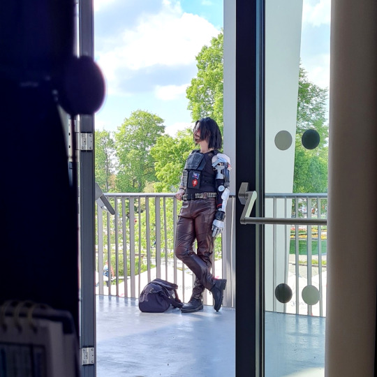
Johnny fucking Silverhand! Including an ominous duffle bag that might have said NUKE... or NIKE, not sure... (find him on instagram @_iggyizzy_). Had a short convo with him both days, he was absolutely living his role, and yes xD Best quote that'll stay with me: "Don't make me laugh, or my beard is gonna come off!" Cosplay problems, I relate so hard :D
Some other highlights:
Explaining my dark fantasy world and setting with the target group "21+" to some very enthusiastic young kids who liked the pretty pictures xD
Talking to other creative people and seeing their projects - also loved the fact that there were several others tabling for the first time, and they all had different approaches that I all loved!
In general being told my art is good by complete strangers who know nothing about it was a huge ego and morale boost xD And being able to talk about a very dear-to-me project I'm passionate about in general was awesome
Talking to likeminded people who got inspired what I was doing <3
Nerding about my favourite video games with people
People really liking my inktober stuff a lot, which I wouldn't have expected
Ending the con with a long conversation with two cosplayers/gamers/creative people discussing tabletop games, Dragon Age, and Cyberpunk for about half an hour :D Was such a nice note to end the weekend on!
As I said, upfront I read up on some random resources online, some dos and donts and useful tips for artist alleys. Some of the tips really paid off ("pack a little emergency bag containing all sorts of materials to improvise if need be") which was useful to adjust some price tags and stuff! Others didn't quite turn out to be as accurate, with my most expensive item selling best in comparison to more affordable ones. I also hadn't planned on offering doodle commissions (which I'd seen people do at other cons) but I will definitely do if I ever get a table spot again, cause they were quite popular. And they made me realize once more why I miss doing commissions and will get back into them soon here, too!
Kinda negative things that come to mind regarding the whole experience are really minor actually, as I mentioned already the slightly chaotic organization here and there, but overall there were always good workarounds to that available, too. And I think/hope next time will work out better! A personal annoyance (but that is just my life in general xD) was getting misgendered quite a bit cause I'm not really passing, and me being too scared of irl confrontation in that reagard to correct people XD But I'm working on it. On the other hand, also had a really nice convo with a fellow queer dude about the abundance of pride flags and stuff, which was fun xD
And what I also learned is that the majority of people who do this regularly work Monday-Friday jobs... which makes sense, that enables you to go to cons on weekends, cause you always have the weekend off. Me, I get one weekend off per month at random (I could request specific days, but they're never guaranteed). So yeh... time to find a better dayjob I guess, if I wanna do this professionally xD Or luck out with my day off requests.
Anyway though... my personal takeaway and what I'd do differently next time:
I enjoyed the whole thing a lot more than I would have guessed
I'd make my stand more visibly lgbtq+ themed, to get people interested in queer fantasy art and writings that would walk past generic-looking dark elves
Also I'd add somewhere that this is an original project I'm working on, cause most people I got talking to assumed "oh this is just dnd stuff" and were pleasantly surprised when they learned "no, this is actually a whole setting and story"
I'm gonna wear a name tag with my pronouns on it (I wanted to do it this time but chickened out at the last moment, cause I'm just with one toe out of the closet irl and got too scared XD one challenge at a time)
I did like how my table was set up overall though and apart from some minor tweaks would set it up like this again
I would like to try to walk around more and get talking to other artists more, but I was too glued to my seat and table and everything (also, mild social anxiety, but everyone that I did talk to was so kind, so yeh XD one challenge at a time!!)
So yes. So much to my report on being at an artist alley the first time XD Would love to try it again some time, cause I had a blast, and cause of the stuff I'd like to improve on.
I still have a bunch of leftovers, too, posters, postcards, and a few booklets... But for now I'm gonna set up a Ko-Fi-Shop (which I'd wanted to do for a while) and put some things there for the time being. Once it's up and running a post will follow!
And if you read this far: thanks for reading ♥ xD
24 notes
·
View notes
Note
To what extent does their appearance in game match your vision of them creatively? Are there things you wish you could change about them in this regard? Or possibly do, if you knew of a way to do so...
I did my best to try and get close when making all of the beans as alts in-game, but honestly if I had my druthers, all of their in-game models would have so many little tweaks and adjustments to match how I see them (especially since I'm awful at getting mods to work and they give me more headaches than I find worth wrestling with them for).
I got a little wordy in this and scrounged my travel laptop for some old doodles and pictures, so this is going under a cut for length.
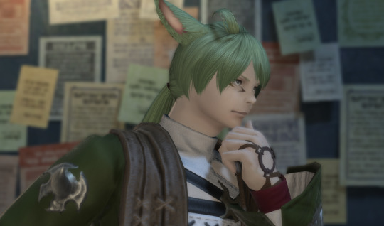
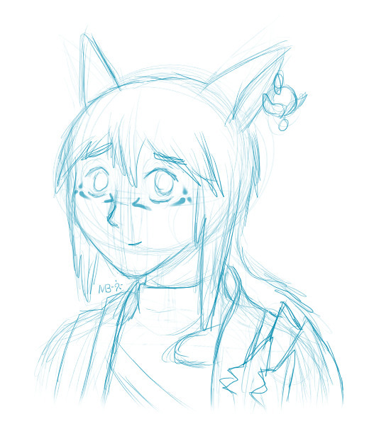
For Ehn, I tend to picture him much lankier than the miqo'te in game; he's long limbed and gangly, and still gets mistaken for a teenager at a distance. He cuts no real imposing figure physically! I also tend to draw his ponytail a little scruffier, and the side-hair thingies longer in homage to his namesake. Kinda like this:
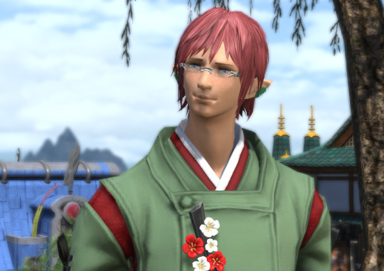
Orrin is pretty much accurate, but did you know that in character creator there's no option for actual red red as a hair color option? I managed to get the idea across with how highlights play with is particular hairstyle, but it still bugs me in certain lights how it still looks... well, pink.
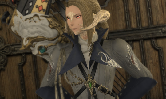
Band... By now I've sort of resigned myself to her just having that horn style, but if I had my way, she'd have had the wing-like horns when I made her (I tried making the face they're linked to work, but it just didn't give that sharp, stern look that I felt was key to the Banadei Experience TM). If SE ever disconnects the horns from the faces, you bet I'm finding an in-character way to change them for her. But for now, pointy horns she keeps. Beyond that, she's a lot less.... curvy, I guess, from the raen models. Still feminine at a glance, but just more... average looking I guess? There's a word for this but it escapes me right now. I also like to think her scales have more of a coppery flash than the in-game gold one for Raen, and her limbal rings are more metallic than they are glow-y. She also has much bigger scale patches on her arms and legs than the dainty ones the in-game model has, as well as a large patch between her shoulders and down her sides (like the male models have. As to why the girls don't get them too I have no idea).
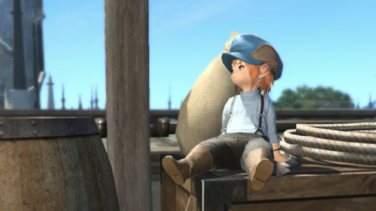
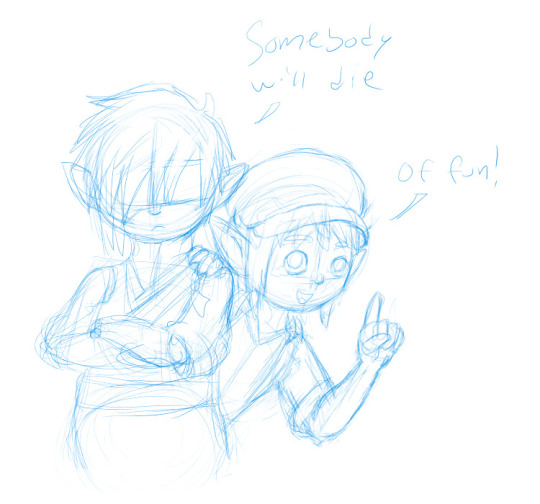
Not many differences on Scrap, really, besides him being kinda scrawny for a lalafell. The most I tend to deviate when I doodle him is more in the clothes than the rest of his features, namely his collar and sleeves and drawing his hat a little smaller but tbh that's just me thinking it looks better that way in my particular art style. (He's on the right in this picture, natch)
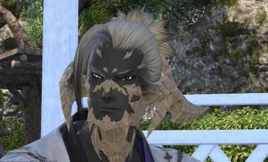
Uroko is, like, the one bean I made in CC first before building the character behind him so honestly, he's spot on as far as things go. Like Band, though, I picture him with more scales on his arms, legs, and torso than the in-game model gives him, but less "bigger patches" and more like the large patches being flanked by spots of smaller patches, like dappled sunlight.
#So many beans so many tags. Hokay here we go...#Ehn Harmonia#Orrin Lyuhe#Banadei Akagane#Scrap the Barrel Leaper#Uroko Taiyo
3 notes
·
View notes
Note
*gets close to mic and whispers*
It's Rosa, b#®ch!
Jk ily, now here's my submission for the surprise date thingy and lemme tell you, I'm sooo happy they're still open.
Now, about me, hmm, where do I start... am a bit of a weirdo, I guess, or well, I've been told that I am a very unusual personality. If you'd like, I could provide some insights on my physical appearance, but I deliberately left that out, as I believe that falling in love has little to do with bra size and eye color.
I am a very private person; I take some time to warm up and won't do that with anyone, but once I am comfortable, I am very passionate, talkative and have been told I have a wicked sense of humour. Also, while I am fairly introverted, I am by no means shy or a pushover; in fact, I have no problem speaking my mind, even if others think it is weird. I do have a clear idea of what I want, but I am not stuck on it and always open to new things and perspectives.
In my free time, I draw and paint a lot, experimenting a lot with different mediums and styles. I also enjoy gardening and cooking, reading, and spending lots of time alone in nature, be it on walks, with my boat on the river or also rock climbing. I am very interested in history, particularly military and art history; trying to reconstruct how the daily life of the people really was like is very interesting to me. And the thought that all of it already happened and nobody can change it also is strangely comforting to me. I also love systems; building them and exploring them in my mind to make sense of the world.
My MBTI type is INTJ and my Enneagram type is 4w5 (I find tests like these very interesting, because they help me make sense of my own and other people's emotions which I struggle with at times).
I value smartness (even though I think of myself as arrogant for it), creativity, uniqueness and individualism. What really annoys me is things like drama, gossip and being forced into smalltalk.
I am into men, and character-wise, I'd love any of the clones, or, if that's not possible, a villain.
Sorry this got so long, I got - once again - carried away, but thought the more information I provide, the more accurate does my match get.
Thank you so much in advance!
Rosaaa! First of all, love getting to know more about you from this. You seem very cool, and I wanted to make sure you were set up with someone just as cool too, so I've called in a favor to set you up with a very special clone. (But I'm also nervous what you'll think about this one since he's not a common character 🙃)
Your date is...
✨Blackout!✨
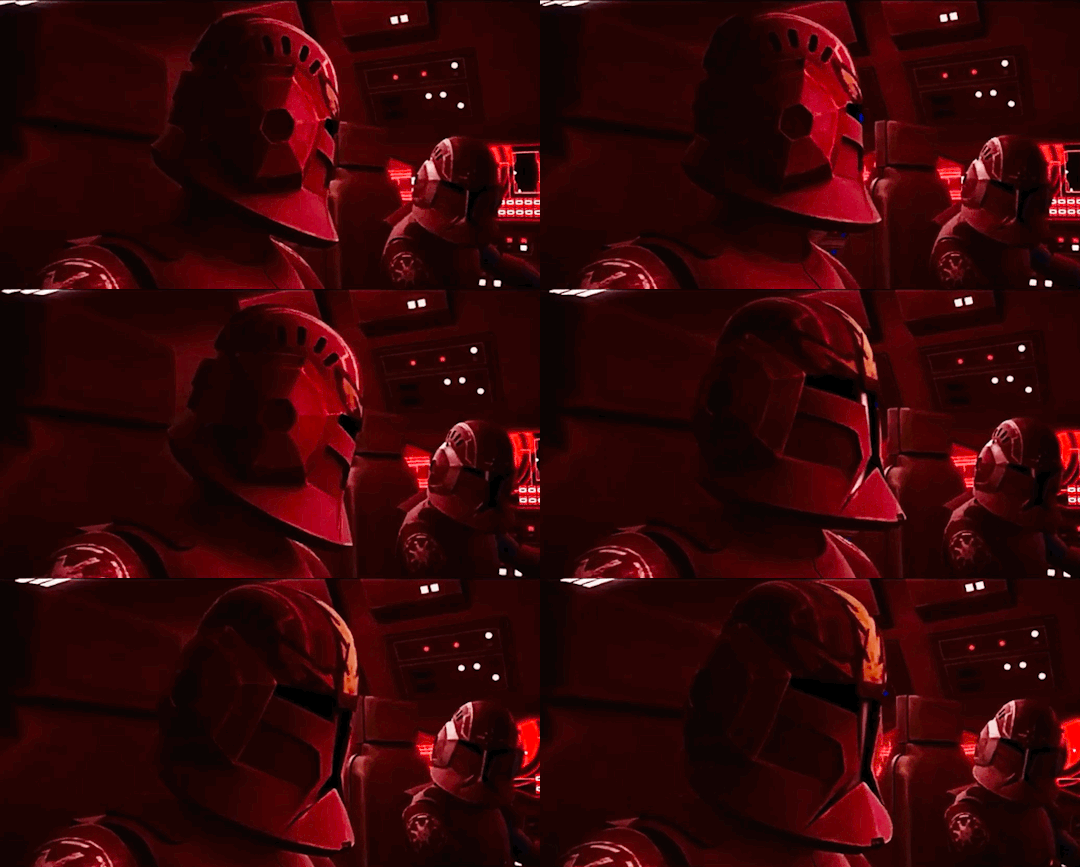
Not much is known about this guy, and he prefers it that way. He won't necessarily go out of his way to maintain his mystery, but he will also prefer your date be in a part of town he knows his clone brothers don't frequent. He'll say it's to explore a new place, but secretly he's nervous and doesn't want anyone to know. What if you don't like him? What if he messes up the date somehow? He'd be so embarrassed.
Thankfully he doesn't have anything to worry about, at least as far as the date is concerned. He walks up to you with his helmet beneath his arm and you can't help but comment on what seems to be a hand-painted design. This immediately launches you two into conversation about art, which leads into sharing about all the crafty projects you've both been working on, which then turns into chat about other pastimes you share. You'll be amazed at how much this guy does in what little spare time he has, and he'll be equally enthralled by how easy it is to talk to you.
You'll have walked side-by-side in conversation all over the city, barely aware of your surroundings as you learn more about each other. Blackout regrets that time slipped away so quickly, he'd wanted to treat you to a drink or dessert or something. His nerves return at the end, worried he didn't take good enough care of you to warrant his ask for a second date. If you gave him another chance, though, he'll definitely prove himself worthy of your affections. You'll be one of the rare few in the galaxy he lets close.
✨
Want to be set up on a blind date with a Star Wars character?
#star wars#blind date#match game#blog-versary celebration#i hope you enjoyed your date!#the clone wars#commander blackout
6 notes
·
View notes